
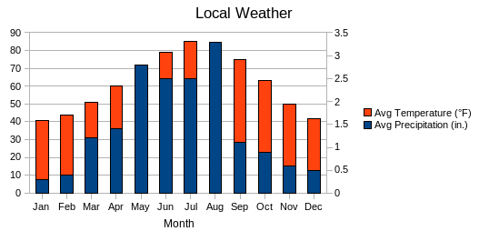
Say you create a chart with two different axes comparing the temperature and precipitation for an area throughout the year. To emphasize the relationship between temperature and precipitation, you combine the data into one chart with two Y-axes. Before OpenOffice.org 2.4, it was only possible to accomplish this:
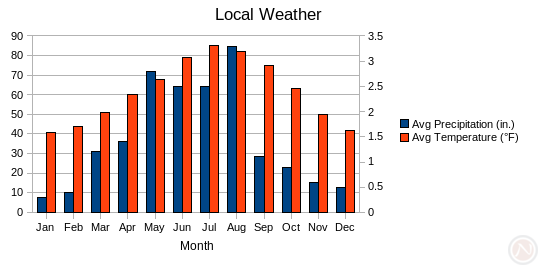
Notice the bars overlap, but now in OpenOffice.org 2.4 it is possible to emphasize the distinction by placing the bars side by side:
How to use
- Create a column chart or a bar chart (typically in OpenOffice.org Calc) with two data series.
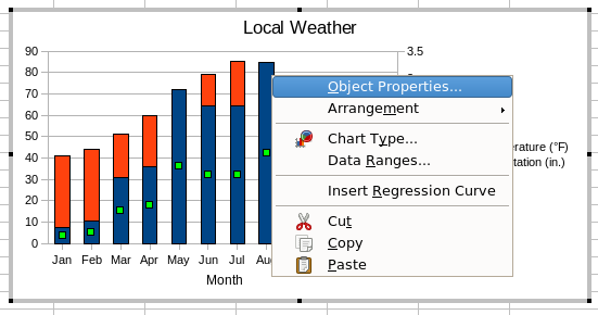
- Double click on the chart to enter chart mode.
- Single click on the second data series to select the data series. You should see one green dot in the middle of each bars of the series.
- Right click on any bar in the series.
- Choose Object Properties.
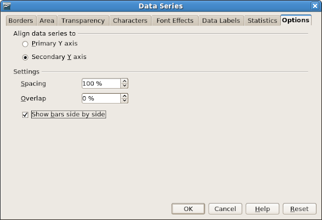
- Click the Options tab.
- Set Align data series to to Secondary Y axis.
- Check the box Show bars side by side.
- Click the OK button.
Competition and retraining
OpenOffice.org does not save this option Show bars side by side in Microsoft Excel 97/2000/XP format. Also, in the Excel 2007 application, I could not find the same option: the limitation is Microsoft's. Bernard Liengme provides a long trick called double columns to accomplish the same goal.
 Subscribe in reader
0 comments:
Post a Comment