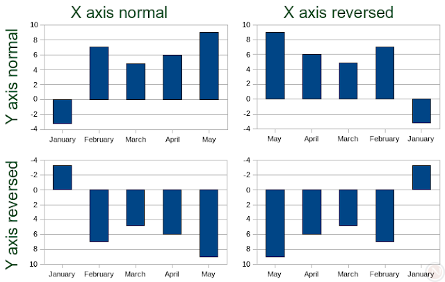
Usually the higher a bar reaches in a bar graph, the higher its value. However, sometimes an upside-down chart better represents the data. OpenOffice.org 2.4 introduces this feature. The following graphic illustrates the four possible combinations with a column chart (a.k.a. bar graph) with two axes, and the top-left hand chart is the normal.

How to do it
- Create a chart (typically in OpenOffice.org Calc).
- Double click on the chart to enter chart mode.
- Click Format > Axis and choose either X Axis or Y Axis.
- Click Format > Object Properties in the menu.
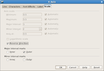
- Click the Scale tab.
- Check the Reverse direction checkbox.
- Click the OK button.

Applies to
- OpenOffice.org 2.4.0 and later
- Column charts, bar charts, area charts, line charts, and XY (Scatter) charts
Competition, retraining, and compatibility
Both OpenOffice.org and Excel 2007 expose access to this feature by right clicking an axis, but the applications use different terms. Where OpenOffice.org has Properties in the context menu, Excel 2007 has Format Axis. In the dialog, Excel 2007 uses the terms Categories in reverse order and Values in reverse order (depending whether the axis has categorical or numerical values) to mean the same as OpenOffice.org's Reverse direction.
There were no Excel .xls file format compatibility issues in my tests except a problem concerning the placement of labels (issue 85826).

1 comments:
Thank you.
I was looking for that feature for some time, having used it once, but being unable to find it again. Your info was excellent.
Thanks
Stewart
Post a Comment