
In May of 2007, Red Hat announced its Liberation Fonts in response to "proprietary fonts present[ing] a barrier to truly open documents in that Microsoft will not license others to redistribute [their popular] fonts." These fonts are metric equivalents: "the fonts assume the identical horizontal spacing as the Microsoft fonts such that, when substituted for the Microsoft fonts, a line of text is identically displayed."
Why does it matter, are there alternatives fonts that really work, and how do you use them?
Why
The college class assignment is to type 10 pages. You type 10 and turn it in. A week later, the teacher returns your paper marked down for not following directions. The teacher says it was only 8 pages. The problem: you used Bitstream Vera Serif which has large leading (vertical space). The teacher didn't have Bitstream Vera Serif and the word processor substituted Times New Roman. The dimensions of each letter vary between fonts and can cause dramatic differences in layout.
Also, when your employer asks for an application in Microsoft Word .doc format, it isn't the time for gambling with document formats and fonts.

Recently there have been many debates about open document standards. Steven J. Vaughan-Nichols points out the problem is bigger than OOXML vs. OpenDocument. Within documents of any format, standards fonts are still necessary to reproduce the document faithfully.
Finding real metric equivalents
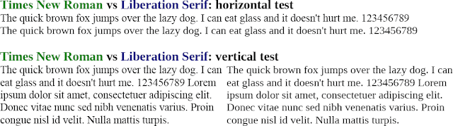
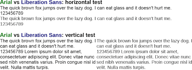
To find the best metric equivalent fonts for the ubiquitous Times New Roman and Arial, I ran some tests.
Against Times New Roman (a serif font) I tested Liberation Serif, Nimbus Roman No9 L, FreeSerif, Bitstream Vera Serif, and Linux Libertine, and the results were mixed. In the horizontal test, FreeSerif better matched Times New Roman than Liberation Serif by a small amount, but Liberation Serif did very well overall.
In the sans-serif fonts tests, Liberation Sans did an excellent job and was the only close match to Arial. See for yourself: the results are available as a PDF and, if you have the fonts installed, as an OpenDocument text .odt file.
Hinting
The Liberation Serif font behavior different according to font hinting. If you use Gnome and want a precise replacement with the Liberation fonts, disable font hinting. The problem is fixed in OpenOffice.org 2.4 (issue 77968).
To replace or to not replace
Should you use the Microsoft TrueType Core fonts or slightly-more-open-source alternatives? It depends.
When your documents are either distributed by PDF, internally within a company that uses the same fonts, or not at all, it's simply your preference.
When documents may be distributed, consider using open source fonts—surprise—by Microsoft. The Core Web fonts are Andale Mono, Arial, Comic Sans MS, Courier New, Georgia, Impact, Times New Roman, Trebuchet MS, Verdana, and Webdings. These de-facto standard fonts are available under an irrevocable open source license and hosted on SourceForge.net (which has strict policies on licenses).
The new Microsoft ClearType Font Collection (standard in Vista and Office 2007) is a different beast. Because of the restrictive license, I suggest not using these fonts for new documents. However, you will encounter them, so you must choose between installing them and font replacement.
Replacement method #1: Fully automatic font substitution
If a font is used in a document but does not exist on the system, the system will guess a substitute. Sometimes it works well and other times not.
OpenOffice.org since version 2.3.0 has automatic substitution rules for the Red Hat Liberation fonts (issue 77470).
Some information is stored in the document. The OpenDocument Specification section 15.4.15 defines 6 generic font families: Roman, Swiss, Modern, Decorative, Script, and System. The Word .doc format may do the same. This font family system does not allow much granularity, so the results are not so good.
I tested this feature with Word 2007. In OpenOffice.org 2.3.1 I created a document with Liberation Sans and Liberation Serif fonts. When transferred via .doc to an XP system with Word 2007, it successfully guessed the family of font (serif vs. non-serif). However, the actual typeface was different, so the number of pages changed significantly.
Basically, don't rely on automatic replacement.
Replacement Method #2: Font fallback within a document
For any range of text, you can specify multiple fonts by typing them in the font selection bar separated by a semicolon. If you work with HTML and CSS, this will feel familiar to you.
OpenOffice.org picks the first listed font. Though OpenOffice.org can store and retrieve this information in both OpenDocument Text and Microsoft Word .doc formats, Microsoft Word 2007 does not support this feature and only uses the first font.
Replacement method #3: Font replacement in OpenOffice.org
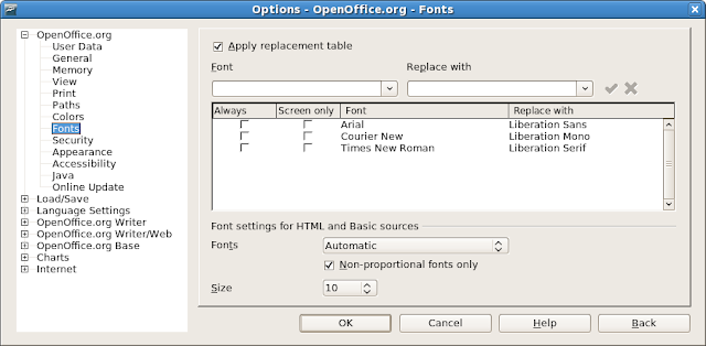
At the OpenOffice.org level, you can specify font replacement rules. That means whenever OpenOffice.org encounters font X, it will use font Y instead.
- Open any OpenOffice.org application.
- Click Tools > Options.
- In the tree menu under OpenOffice.org, choose Fonts.
- Check the box Apply replacement table.
- Type the name of the Microsoft font in Font.
- In Replace with, type the name of the non-Microsoft font.
- Click the green checkmark.
- Repeat steps 5-7 as needed
 Subscribe in reader
6 comments:
Thanks for the explanations!
One note though: Arial/Times/etc. are not "open source". The corefonts project itself is, but it's a script to download the microsoft fonts from the microsoft website by the end user.
You can see that Debian classifies corefonts as "contrib", which means it's free software that depends on non-free parts.
The copyright file says "This package is not part of the Debian GNU/Linux system but located in the contrib section. This is because it's not functional in and of itself but depends on downloading the fonts which are not under a free licence."
http://packages.debian.org/sid/msttcorefonts
Beuc: The script on http://corefonts.sourceforge.net downloads the fonts from the sourceforge website, not the microsoft web site. Also, without the script, you can download the same fonts from SF, which discriminates against hosting non-open-source software.
It would be foolish to assume that *absolutely* everything that is on sourceforge.net is properly free (GPL or similar). There are a few mini projects that take license restricted files and unwrap them into a more convenient file format.
This does not change the fact that the content is still restricted.
If you take a license restricted windows .exe and unpack it (corefonts.sourceforge.net) you still have not altered the fact that the content is not free. All you did was take it out of a crappy wrapper.
If you want fonts that are free then you must check the license of those fonts.
Here is some blurb about licences that would be properly termed 'open source'
http://www.gnu.org/philosophy/free-sw.html
there are more if you want to read around.
The whole point of a font that is owned by a company that makes a proprietary desktop (Vista) is to make it unhealthily difficult to open documents on a similar but different *free* desktop.
That is why Vista will never incorporate truly free fonts and why every time somebody makes metric equivalents that are truly free, the next version of windoze/office will introduce some new restricted fonts. This time it is Calibri,Cambria,Candara,
Consolas,Constantia,Corbel
and next time there will be
a handful more.
If you are really desperate for
these new 6 fonts then either
dig in to help create metric
equivalents or maybe just
bite the bullet and
use Vista+Office97 instead
of dallying about.
Would you please repeat the test (i.e. re-open the OpenDocument text .odt file and save it as a PDF) again with a recent version of OopenOffice.org (and of the fonts)? As you mentioned yourself, the reason for the different metrics of Times New Roman and Liberation Serif was a problem in the font hinting that is fixed in OpenOffice.org >= 2.4.
LMSans10 seems to match Candara fairly well.
Posting here because I cannot find this info on the web: is there a way to make ooo display the substitution font currently in use?
I find it annoying that (on win), new paragraphs get tagged as Helvetica, but I cannot set a selection of text to Helvetica on demand. I might set it to Arial, but what if the doc is later opened on a pc where both fonts are installed?
Post a Comment